Our Location
304 North Cardinal St.
Dorchester Center, MA 02124
304 North Cardinal St.
Dorchester Center, MA 02124
Triphop is a zero-commission online travel agency that helps eliminate inefficient travel intermediaries and connect travelers directly with travel brands, and at the same time, gives excellent in-stay benefits, rewards, and cash-back.
The main company’s objective is to offer the best price deals for hotel bookings, and we decided to make a focus on that.
Triphop described their need as “platform redesign,” and that’s quite a natural step for a modern prospering company that strives to be up-to-date. Our design solution should have helped to retain existing clients and attract new ones for that we needed to define a visual brand to make Triphop stand out among well-known competitors.
Besides, another great challenge was to uncover the best competitive opportunity. We came up with the idea to tell a client, “don’t worry, you won’t spend extra on this platform, vice versa, it’ll help you save”. With that in mind, we started.

Through our initial research, we streamlined the workflow into the new information architecture. Our exploration of all collected data helped us understand the platform’s breadth and the pain spots we need to focus on, to improve current functions and implement new features further.
“Pay Less For Any Hotel. Anywhere, Anytime” and “Save time and money” were the two taglines that inspired us most. What kind of audience tries to get the most out of least? The youth.
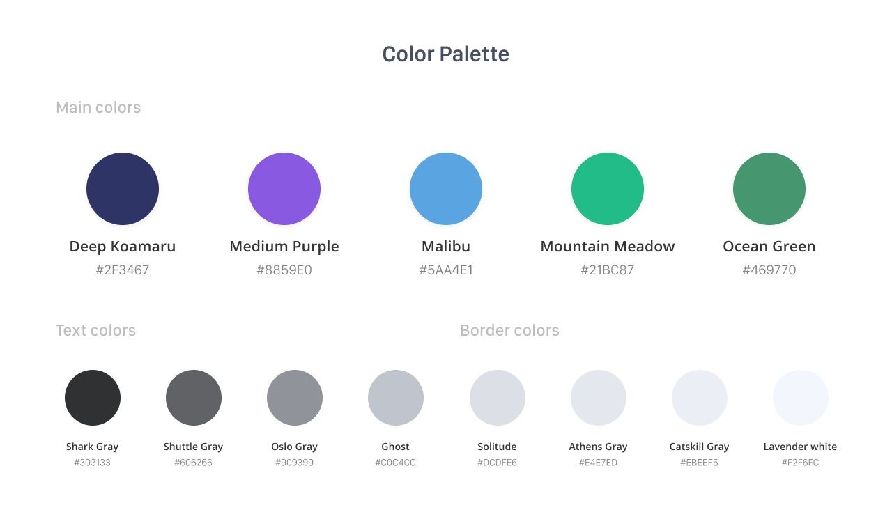
Triphop greatest rival was focused on a quite broad audience that gave us an excellent opportunity to target mostly young aspiring people. That’s how we chose purple as our primary color; for us, it denotes reliability and yet creativity. It combines the rebellious spirit of the youth, and at the same time, it chastens.

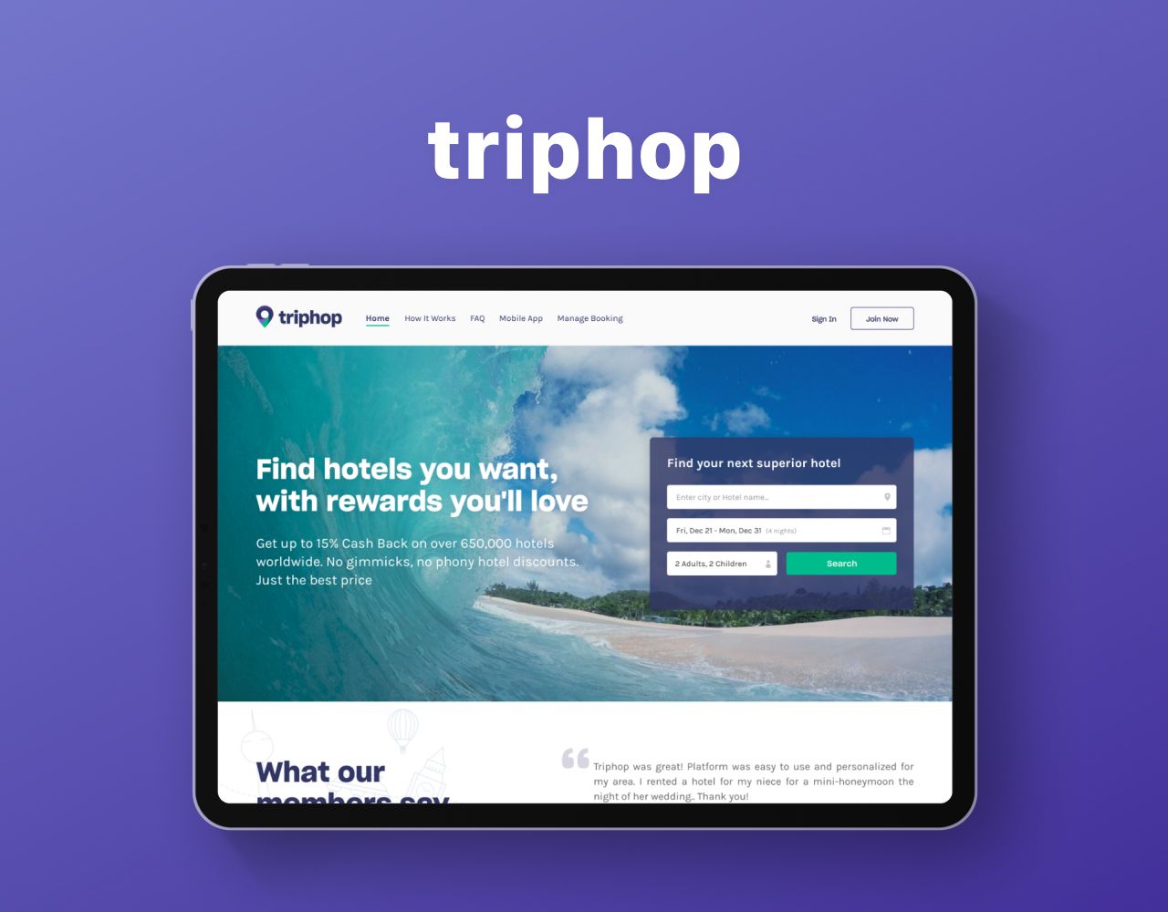
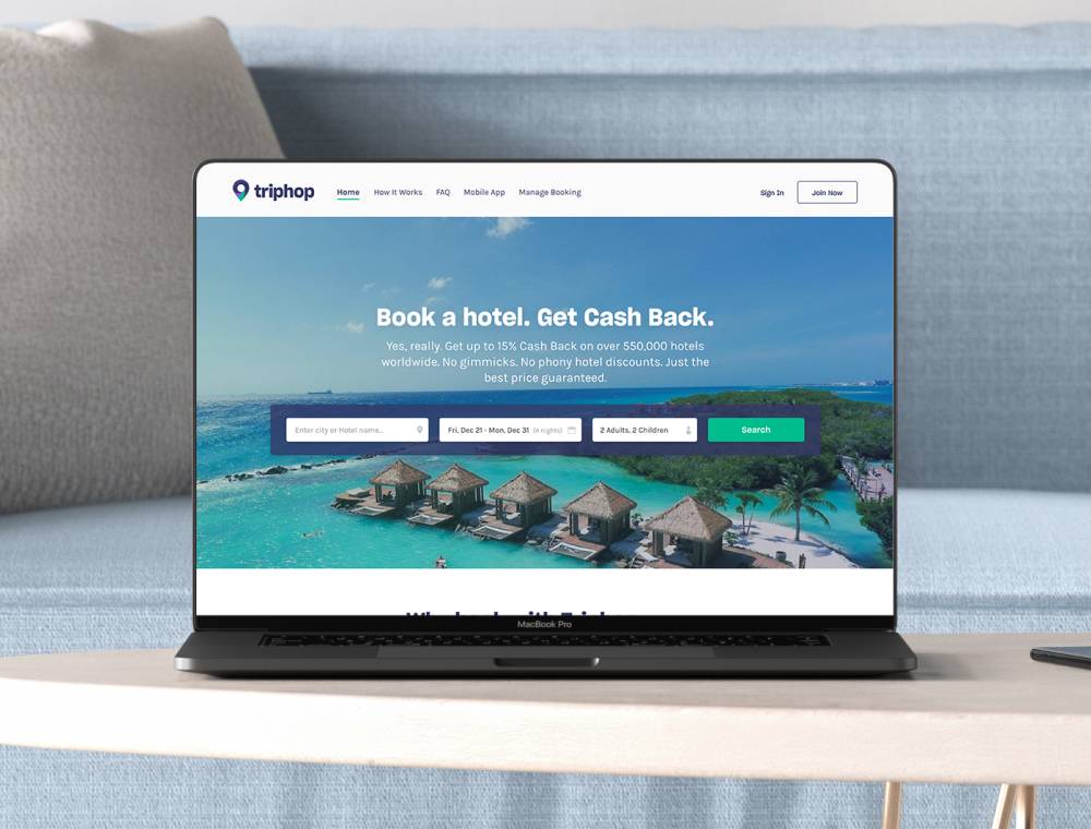
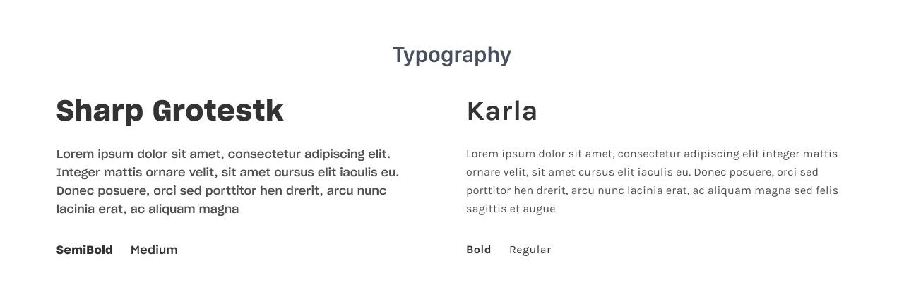
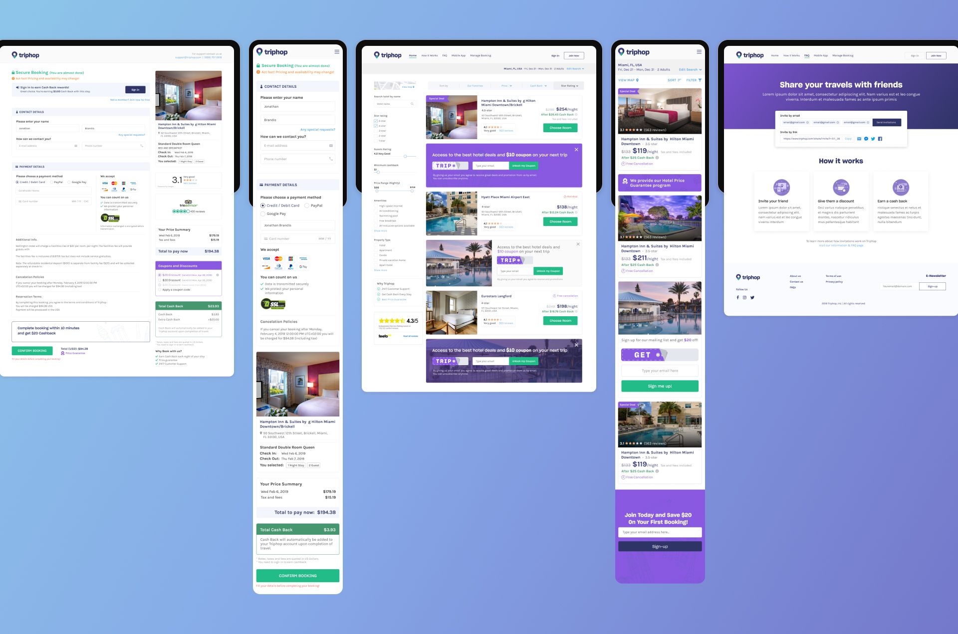
Design is an idea that always requires new solutions and lots of experiments. Therefore, after analyzing the design of competing solutions and synthesizing all the requirements, desires, and feelings of the stakeholders, I chose a light background, simple forms and relaxing pastel shades of purple for the font, icons, and other small elements. The interface should not have to distract from the main goal – travel planning, so we had to prevent any disturbances in a clear perception of visual content and interaction with it.
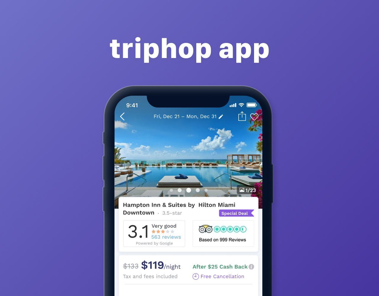
The search and offers discovering is the core feature of the platform, so search fields, filters, and sorting options were the must-have elements of first screens, cause they immediately give a clear understanding of how to use the platform in a right way
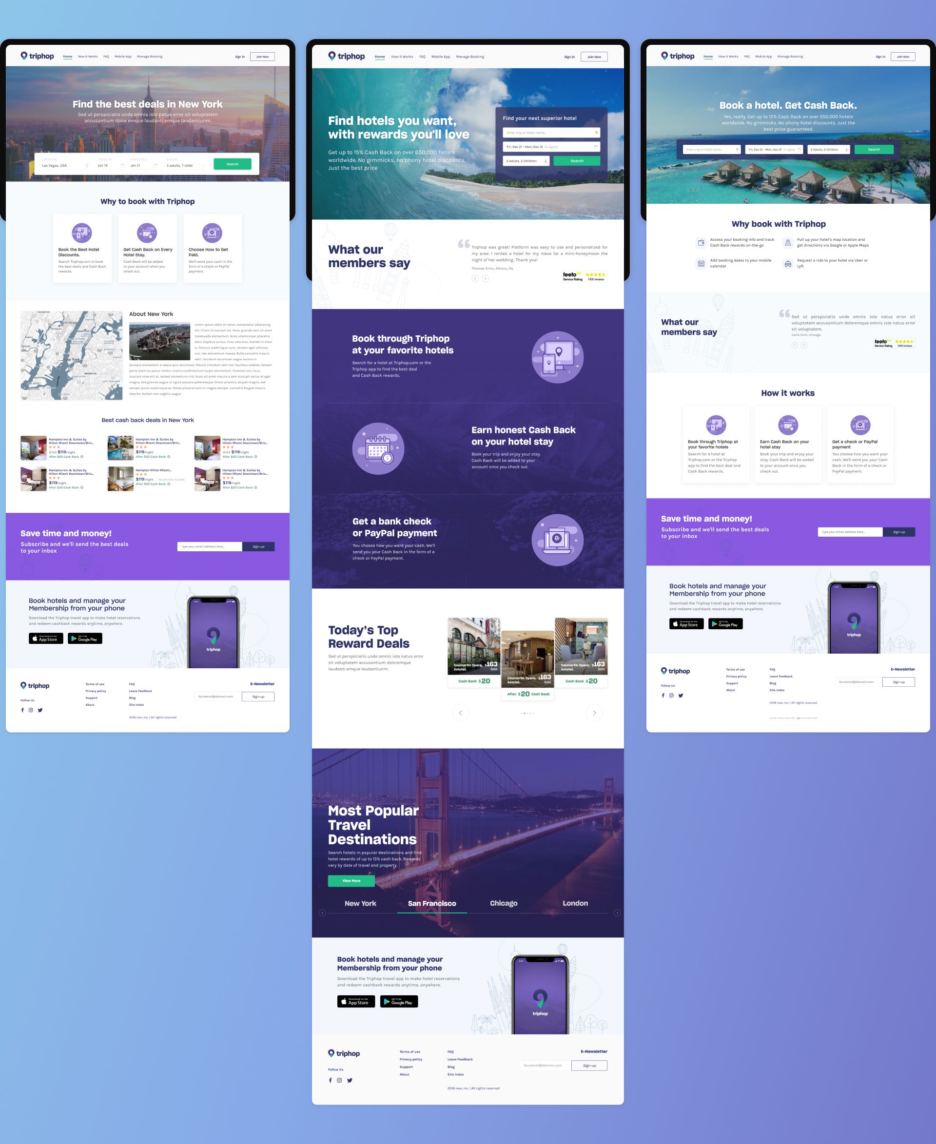
Next, we put down feedbacks, positive reviews, and some links to other sources of social evidence: we know that young people trust their peers and need side opinion while making a decision.
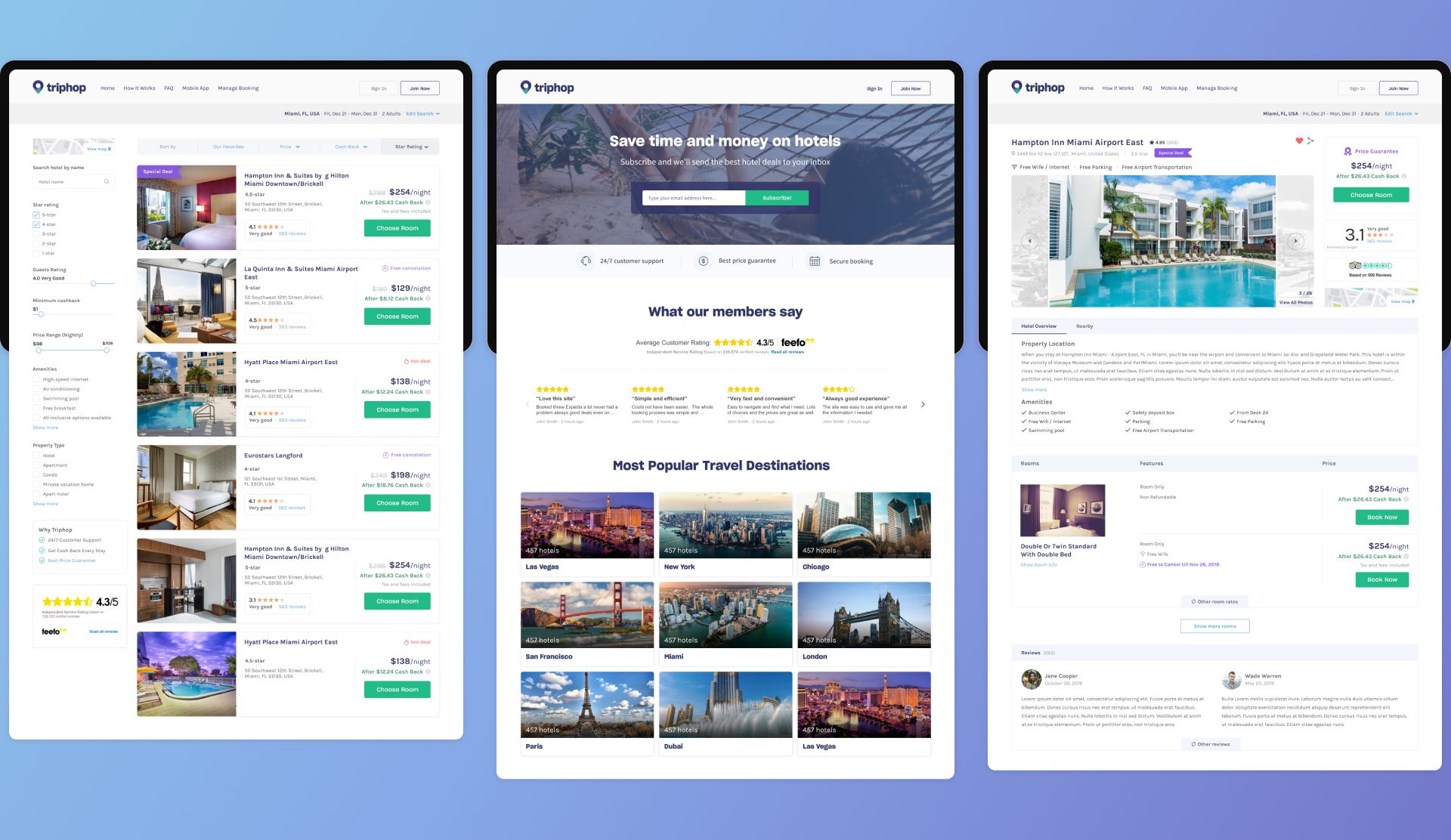
During the research stage, we found that special offers, promo codes, and selected top deals are also playing a significant role in making purchasing decisions for our target audience. So we added that kind of things on some screens as additional factors that can call to target action.
Ultimately, we redesign and rebuild the platform with new significant improvements. And as a result, customers received a much clear, understandable, and affordable platform that can help in fulfilling traveling plans, save time, money, and multiply all the positive emotions and anticipation from the upcoming long-awaited trip