Our Location
304 North Cardinal St.
Dorchester Center, MA 02124
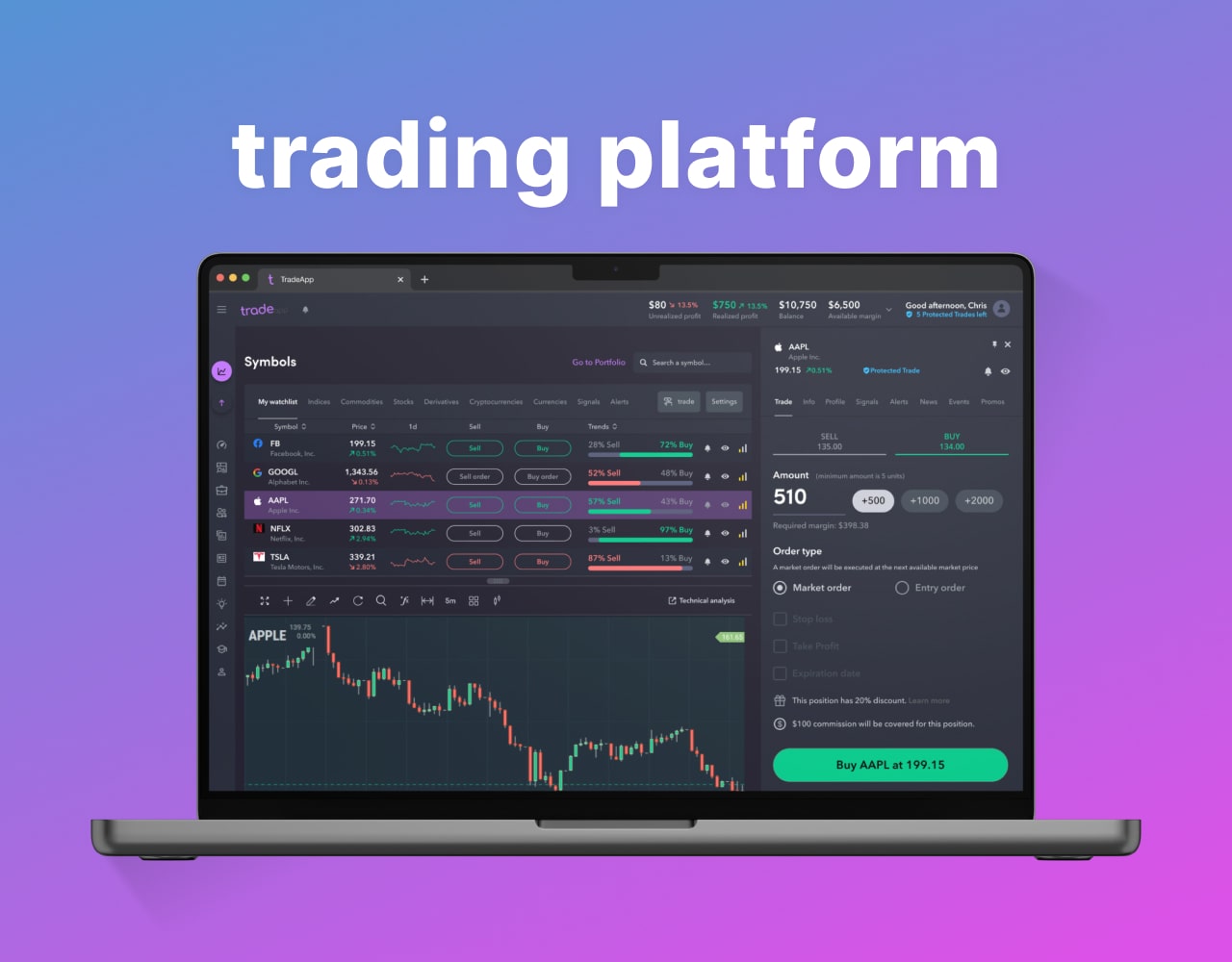
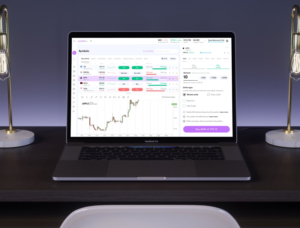
A trading platform acts as a white-label tool for brokers, providing excellent solutions to their clients. The design process was centered on optimizing user experience. The goal was to create a UX that could keep customers engaged on the platform, providing modern trading tools at their fingertips. It was more than just functionality; together with stakeholders, we aimed to transform how users interact with trading platforms, offering an immersive and intuitive journey.
In collaboration with stakeholders and the development team, we embarked on a ground-up approach. With neither a product nor user base, our foremost goal was to sidestep any initial missteps that could veer us off course.
This strategic start was vital to ensure that our trajectory aligned accurately with the intended direction, setting a strong tone for the journey ahead. Grasping the multifaceted needs of experienced traders and newcomers presented a complex challenge.
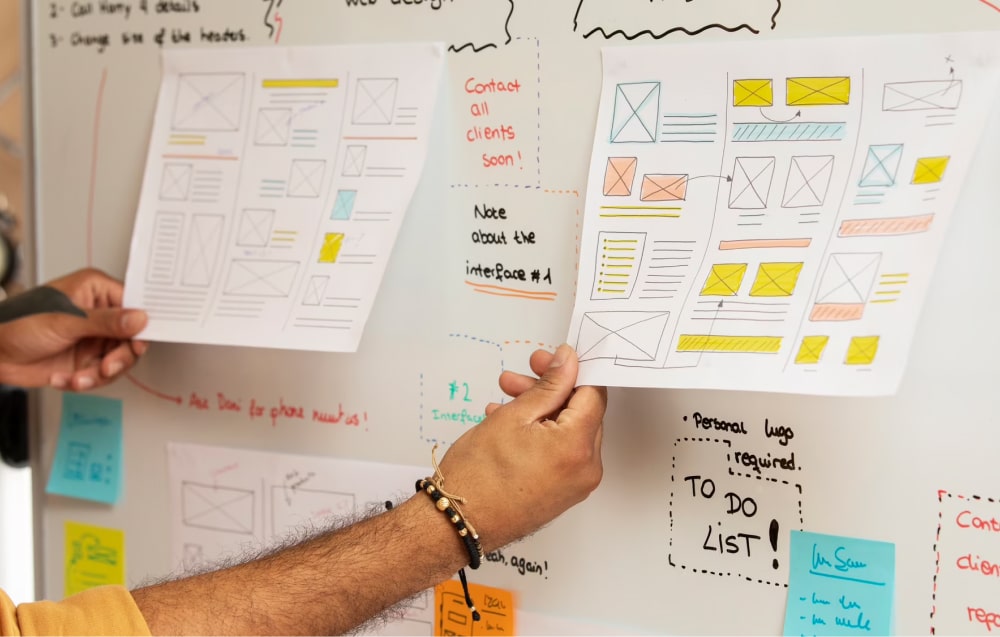
The process involved bridging significant knowledge gaps and delving into the nuanced intricacies of the trading industry. We started with a series of in-depth user interviews to obtain a holistic understanding of the tiny nuances of traders’ work
Using insights from the discovery interviews, we constructed authentic user journeys with actual data. This laid the initial groundwork for the prototype. We focused on smoothness and simplicity, refining it through continuous iteration. By identifying and prioritizing key points in the user journey, we charted a clear roadmap for the product’s evolution.

Gradually, the prototype transformed into a comprehensive design, forming a robust product foundation within a few months. It incorporated pivotal trading platform features: a trading screen with position journey and graph, portfolio, and an overarching dashboard. With each challenge conquered, our path towards seamless user experience became clearer. Our design philosophy centered on clarity, enabling the product to convey its value effortlessly, void of elaborate explanations.
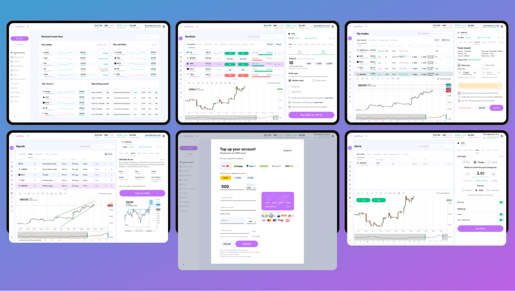
We also passed through a few iterations on the visual design and feel of the mobile application, where we worked on the order of UI elements and tested the options of the final visual layout.
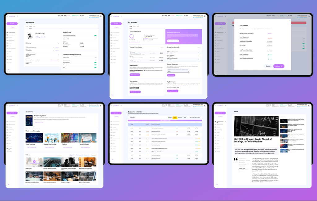
The main focus was on how our product communicates with users, so we wanted to be sure that we were using the suitable types of interactions that assist customers to use the app in a convenient way. We were able to see what would and wouldn’t work within our interfaces and how our ideas would match users’ expectations.
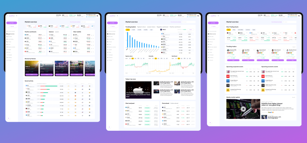
When the final design deliverables had been discussed together with all product owners and stakeholders, and after a few rounds of valuable feedback, we applied the final decisions to the UI design of the trading mobile application, and the build was realized to the market.

By the end of the project, the product team gained a lot of understandings vital for planning the future roadmap of their mobile application, and most of the priorities became vastly transparent. As they saw the force of user interviews and an iterative approach to design development, they committed to talking more to product users and potential customers during all future development interactions.