Our Location
304 North Cardinal St.
Dorchester Center, MA 02124
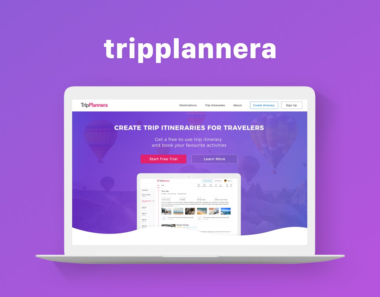
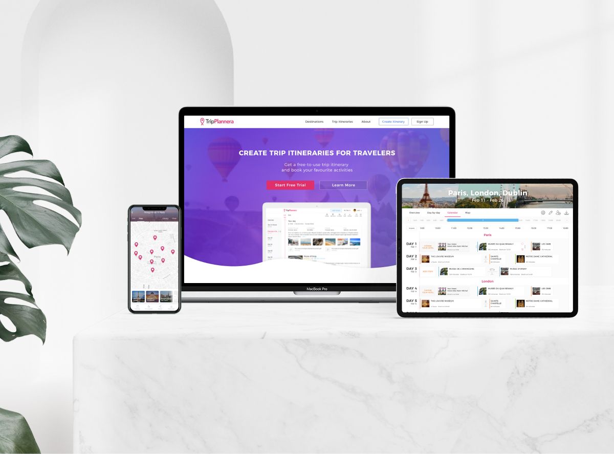
Today, travelers don’t want to buy boring ready-made tours or just book tickets and no-name hotels. They want to get something more personal and unique with the ability to plan the entire trip “from” and “to” in detail. Meet a Tripplanera – a platform, which allows you to build any routes, organize leisure time during the trip, and get the most of your holiday time so as not to miss anything.
Tripplannera’s primary request was to combine a vast list of user needs in an understandable and simple interface. The set of functions was extremely diverse since both travelers and travel agents are the platform potential users.

After some discussions and brainstorming, we decided to focus on the core benefit: showing the users that they are able to plan the day counting every minute. The unique tool offers varied options for leisure time, adding various events to the calendar and setting notifications for the best time-management.
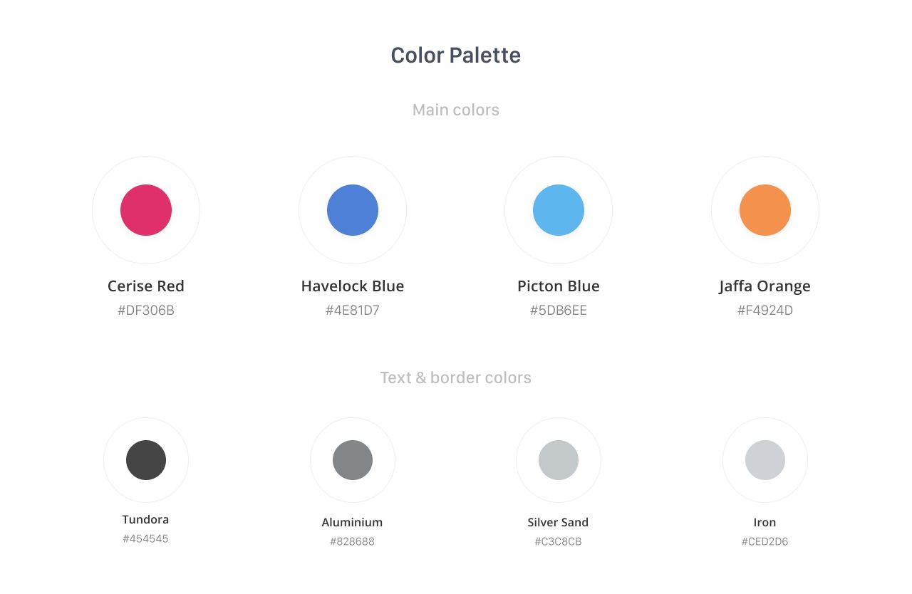
Since main segment of our target audience were newlyweds, couples, groups of friends, and young and active travel managers, we decided to choose bright colors and simple, accustomed fonts, such as Open Sans and Montserrat.

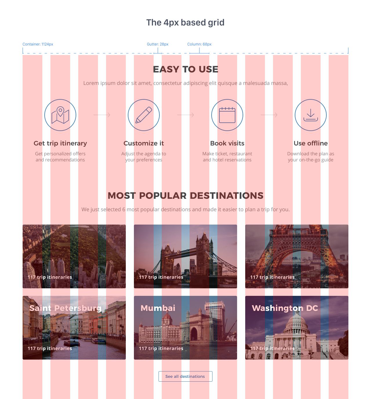
It was extremely important to show future users that the product helps plan and create trip itineraries, so we prepared dedicated landing pages separately for travel agents and for travelers, where we explained in details the key features of the product.
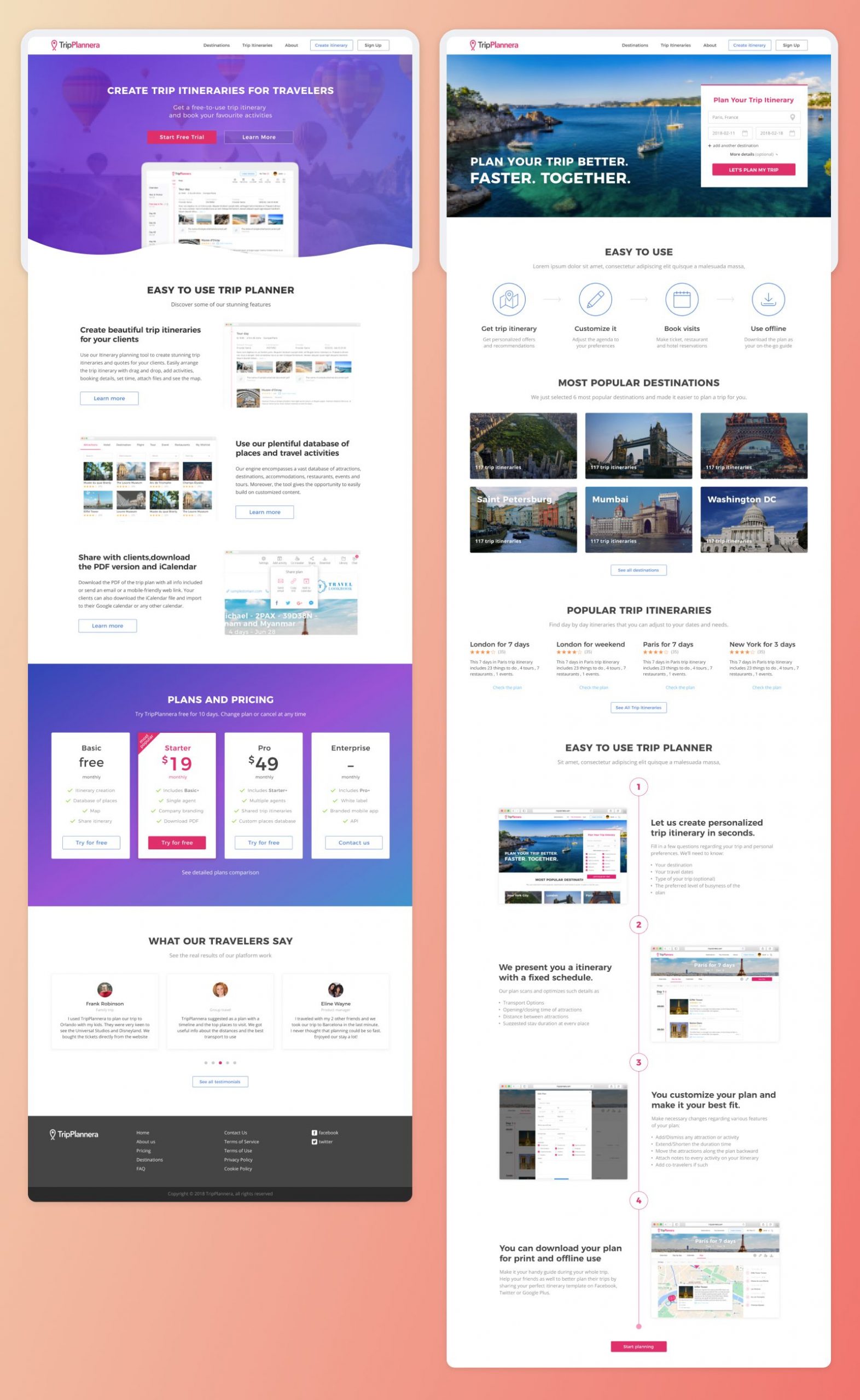
All the templates of itineraries can be created only by agents, so we tried to give them the opportunity to create travel routes, add attractions and locations, update event databases, post information about their companies and manage all other aspects. Once the template is done it can be found by the travelers, so they can select it and enjoy the benefit of planning the route simultaneously with their fellow travelers.
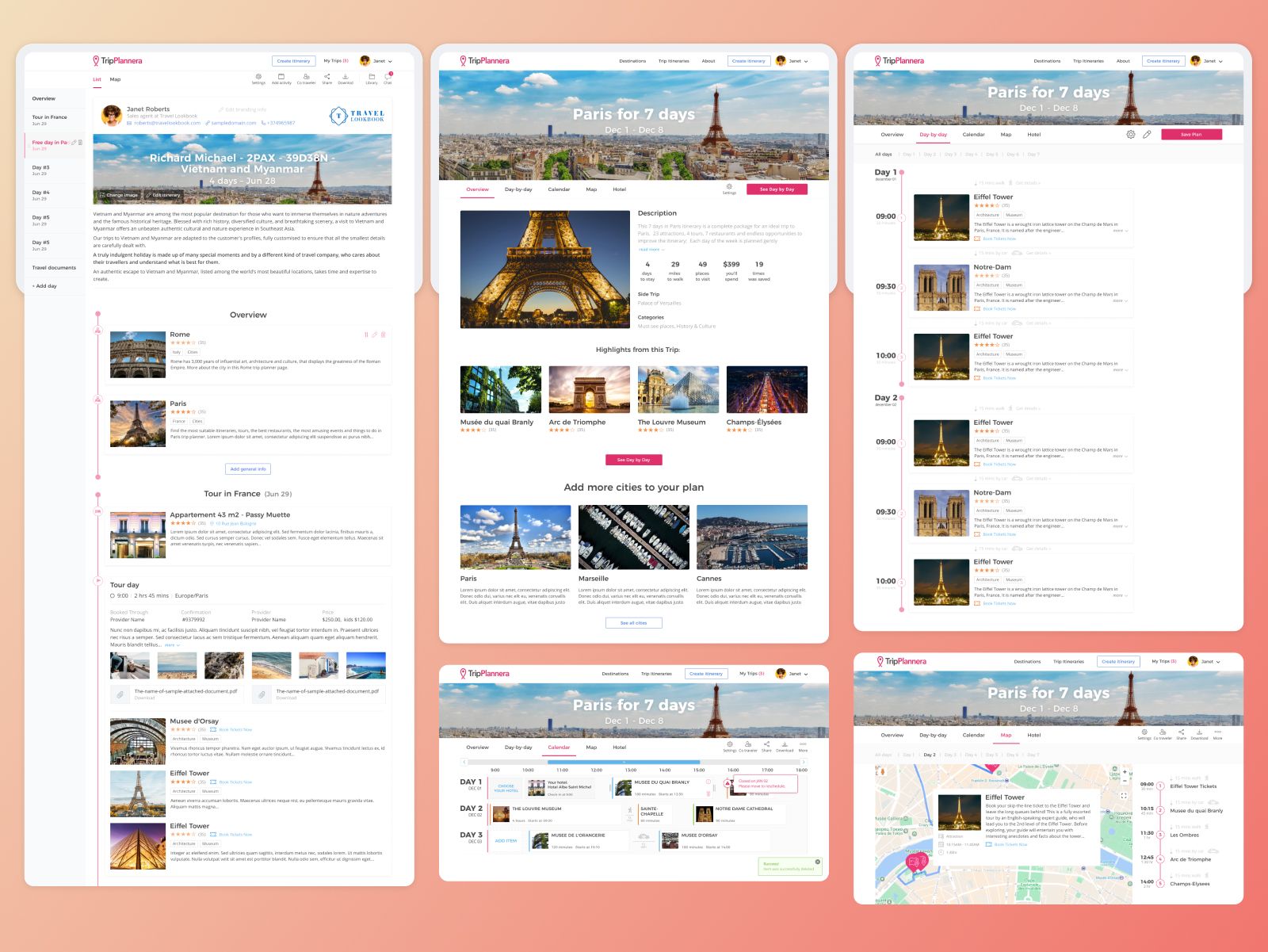
Moreover, all users should be able to have all the routes directly on the map, download PDF files with schedules, and save day’s events to cloud calendars. Despite the abundance of functions, we tried not to overload the interface and make the product more user-friendly with a clear interaction experience.
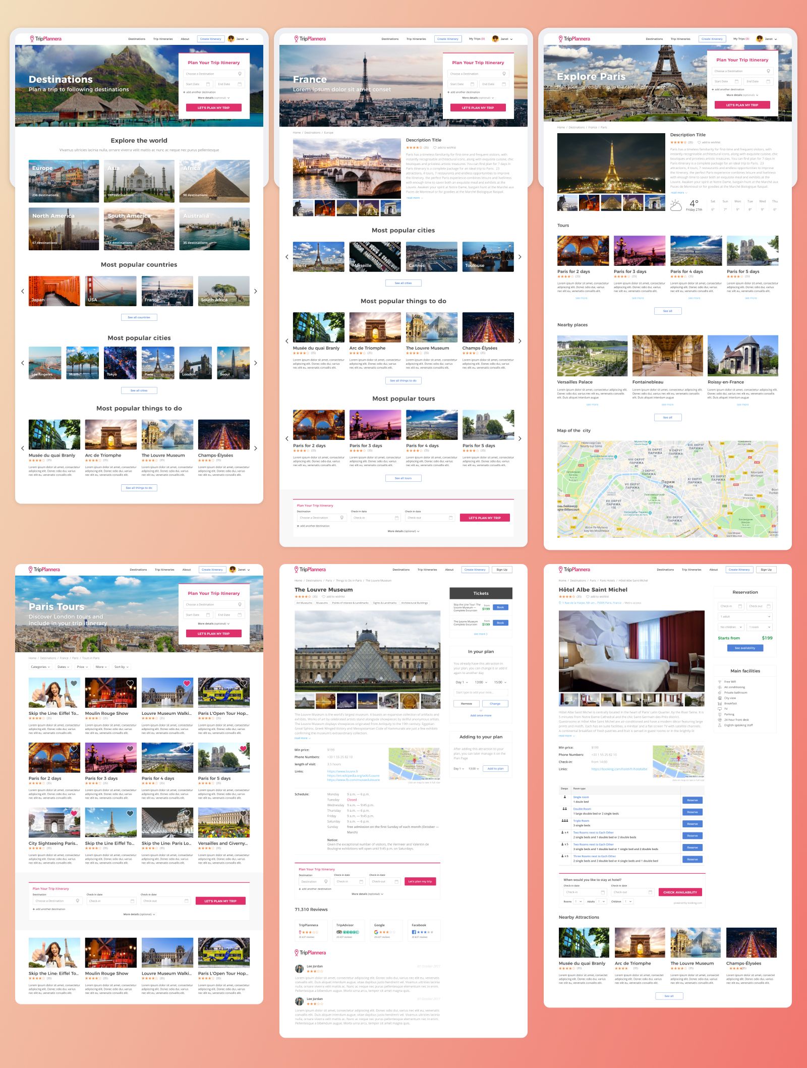
While working on projects with a bunch of functionality, it’s important to remember that reducing the amount of user effort in interaction with a product should not be an end in itself. Usually, a user doesn’t tend to estimate how many functions a certain product can contain at the same time remaining user-friendly.
Positive feedback regarding the platform’s performance, that we received during surveys, is a genius compliment to us as it means that we did our job successfully.