Our Location
304 North Cardinal St.
Dorchester Center, MA 02124

UX missteps and mistakes can cost a company its very existence. Failing to create a positive, seamless, and valuable user experience can, and will, result in lackluster performance for your product. Done correctly, UX design is entirely invisible. Users feel that their interactions with the product are wholly frictionless and easy. Done poorly, UX design is clunky, obstructive, and painful.
There are some common mistakes that people often make when it comes to their UX. If you can avoid them, you can save yourself a lot of trouble and money. Failing to see, understand, or use your service can be detrimental to your growth, profits, or even the future of your product. So before finalizing your design, make sure to do everything in your power to avoid some major UX design mistakes.

Your product’s IA should be well designed and easy to implement. If you can achieve this, then your first-time users will have a good experience, and more importantly, you will lower your bounce rate. Information Architecture is the foundation of any digital product, so it must be understandable, meaningful, and neat.
Nowadays, web products contain tons of pages, sections, and blocks with bunches of information, including videos, audios, animations, images, text, etc. And the primary goal of IA should always be to adjust all of that information to provide the best user experience for your users.

Everyone knows that putting the users first is still the right thing to do. But it’s not the only thing to focus on. Various things can affect your conversion rate. We can put these factors into three main groups: related to your website, related to the potential user, and finally associated with the message your product carries.
Messages should be compelling, with clear calls to action. It sounds simple, but in reality, people often make mistakes here. If you want to succeed, then creating a good, natural product’s voice is essential, cause a confusing or unconvincing message can lower your conversion rate significantly. Focusing on the users and communicating with them clearly, in a persuasive manner is crucial to growing your product.

UX design made based on data is the only real UX design. The rest is intuition and guessing. Without the actual data and analytics, you will not understand your numbers, metrics, traffic, target audience, and, ultimately, your existing customers. That cannot result in success.
Because of the different nature of various businesses, the approach of UX designers is always unique. It is essential to forget the previous experiences and focus on the collected data and take steps accordingly. Learn about the audience, traffic, use cases, decision points, etc.
User research is a cornerstone of a successful UX design. Failing to understand your users most likely means that your product will suffer or even worse. Don’t do research just once at the beginning of the project, doing user research many times during the process of designing and product development is a good idea. It can help businesses in understanding whom they are making the product for.

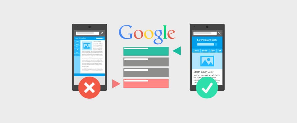
The philosophy of going for mobile-first has started to ensure positive experience (regardless of the device) and to prioritize content. But because of time and money limitations, going mobile-first often means going only mobile.
Since 2010, after Google announced that they would prioritize mobile, this has been the trend. But sometimes trends should be ignored. It is not always the right answer. For some businesses, it is a clear choice, but for some, it is not the best option.
So before you decide, for your product, ask yourself these:
If you have answered ”no” to most of the questions, you should avoid going mobile-first.

To fully understand your users and their needs, you must do focus group testing. It will provide you with an understanding of your users’ ways of thinking, unconscious behaviors, and other quantitative and qualitative data. You can even get some fresh and unexpected ideas. The insights that testing can provide are irreplaceable since it provides you with information that immense value to create a successful user experience.
Failing to conduct focus group testing properly can be a costly mistake since you will have created a product that is based on wrong information about your customers.

The seamless and unnoticeable experience is the best one. It is smooth and straightforward for the users, but to get to that level, you have to make hundreds of decisions and adjustments along the way. If the UX design is successful, the user will not even think about it. They will be focused on your product instead of saying to themselves, ”Why is this here?” or ”This is so annoying”.
The less they think or even comment on your interface, the better. That means that you have done a great job, and they can simply focus on the service your product provides. But this is not an easy goal to achieve. We all have experience with some products, apps, and those websites from time to time, to which we rarely want to go back again.

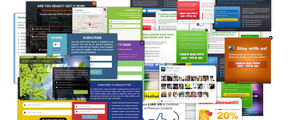
For example, pop-ups. We all hate pop-ups, especially the ones that are full-screen or difficult to close. Very annoying. They block your content and annoy the users. The users are trying to react to a pop-up window in some way, the user experience success is diminishing every second, and ultimately your conversion rate is lower than ever.
Having any of these dangerous elements of UI will increase the bounce rate, and that is the opposite of what you want. You will lose your potential users even before they get a chance to get familiar with your service. And even worse, they can damage your brand.
In some cases, these elements can be successfully implemented, but it is a fine line between good for business and annoying to the users. So be careful, always think twice before using any of these controversial UI elements.
There’s no doubt about it: UX is a minefield. But for every potential mistake, there is an equal opportunity. For every person who fails to provide compelling messaging, there is someone who stays on point with a powerful voice. For everyone who bombards their users with annoying pop-ups and banners, there’s someone who allows them to enjoy what they paid for quietly. Try to be the latter kind of developer, and you’ll watch the users roll in.